Field guide
This site is a publishing surface, not only a portfolio.
Pages stay HTML and CSS. A #>frame names a room. A chip names a next room. Some people read the sentences. Some people scroll the rooms. The sentence should already hold.
Make a page. It does not need to begin as a studio. HTML and CSS still show hierarchy, consequence, and neglect. SVG on this site is the same craft: a diagram that can keep an address. Notes become public when they land on a route, not when they stay in a vault. The pieces on my bench, with the saves each has left so far, are on projects.
Read this as a guide to what already exists, then as a map of the next room. A publisher's reference is a page that still names its own parts.
Reference document anatomy
- current route and persistent navigation
- what this page explains
- image as evidence, not decoration
- next readable surface
If you want a site like this, services or contact is the door. The rest of this page is the standard in use.
Design Fit
These chips are live settings, not decorative placeholders. Use them to see whether the page still feels composed when the emphasis shifts, then decide if that same design standard would help your own route, archive, or public product surface.
Discover Why The Color Is There
Named palettes keep color tied to purpose: offer, signal, review, or brand continuity.
palette reason → visible SVGCompare A Screenshot Surface
A screenshot-ready SVG should expose labels, CTA regions, trust cues, and the query that produced its state.
screenshot semantics + query stateTurn The Method Into Practice
When the philosophy lands, the next step can be a learning route, a recipe surface, a community project, or a scoped conversation.
field guide → project-based learningLive Runtime Controls
Set the guiding perspective, then judge whether the page still feels composed.
Current dimension: situate. Wonder memory is nearby, and color mode is auto.
The point is to show that a premium surface can stay readable while its emphasis changes. For the full browser-local control surface, open runtime preferences.
Settings are stored locally in this browser.
Curricularized Codebases
Typed seams, visible route metadata, and explainable component roles turn implementation into onboarding, technical diligence, and public proof of judgment.
@systems_offerKnowledge Systems
Internal anchors, route-aware cards, and visible tuning help a concept library or field guide feel cumulative instead of flat.
!shape[project]Product Documentation
Software and language pages can keep inspectable structure while still feeling deliberate, image-led, and presentation-ready.
~design_routeDistinctive Archives
A route can communicate references, thresholds, and genre without collapsing into novelty for novelty's sake.
~follow_playPresentation-Ready Pages
Pages meant for demos, streams, and live walkthroughs benefit from named regions, honest controls, and copy that stays intelligible on first contact.
!start[conversation]Website Philosophy
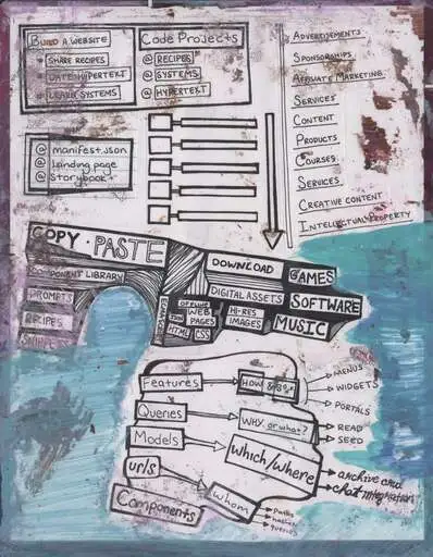
The website is not trying to impersonate an app shell. It is trying to prove that a static page can gain semantic depth, route memory, and projection logic without surrendering legibility.
Orient
Enter the page as a place
- Open the field guide frame#> Start with the opening scope before you inspect the details.
- Use the reading instructions? The route is meant to be entered in layers instead of skimmed as a dashboard.
- Step back to the broader about surface.context The website philosophy stays anchored in the wider author and practice context.
Inspect
Study the site as a system
- Read the feature register^ See which affordances are already active and which ones are still speculative.
- Inspect the design details~ Follow the texture, palette, and surface logic instead of treating them as decoration.
- Follow Spw from research to toolchain# The long arc, the strategy in plain terms, and why the abstractions should last.
- See how the engineering is paced~ What loads first, what waits, and the numbers you can check yourself.
- Trace the machine register$ The inspectable contract should stay visible underneath the rendered page.
Commit
Prefer meaningful thresholds
- Read the interaction register@ A click or hold should improve the model of the page instead of only flashing feedback.
- Inspect promptability@prompt Prompt-facing surfaces should stay tied to authored source, not drift into novelty UI.
- Tune the public shell@settings Density, theme, and semantic visibility are part of the publishing contract.
Project
Follow the same idea into other surfaces
- See the publishing register> The field guide becomes media rhythm when the same structure is published repeatedly.
- Read the media thesis>media Projection means one authored logic appearing as several public encounters.
- Move into the operator atlas>atlas The public website and the language surface should generalize the same semantics.
Readable before impressive
The first contract is that the page should still make sense when JavaScript is late, CSS is reduced, or the reader only understands ordinary HTML. Semantic depth, SVG surfaces, and prompt layers are added structure, not a replacement for basic legibility.
Locality before app-ness
A page should feel like a place with nearby rooms, not a thin launcher for global controls. Frames, braces, and route links are there to make locality tangible so the reader can feel when they have entered, inspected, or departed a scope.
Projection instead of duplication
The same authored idea should be able to appear as prose, a card, a guide page, an SVG host, a prompt seed, or a plugin-facing note. The website is one projection surface among several, not a disconnected rewrite of the workbench.
Thresholds should teach
A click, hold, reveal, or route pivot should improve the reader’s model of the site. If a badge, brace, or chip implies action, it should either do something meaningful or stay quiet enough that it does not promise a missing layer.
The public site is a field guide
The plugin and local workspace can stay denser, sharper, and more technical. The website’s job is to translate those same semantics into a medium that is welcoming enough for collaborators, clients, artists, curious readers, and even simpler coding models that need an honest surface to continue from.
Static does not mean shallow
I want the site to keep proving that static publishing can still have inspectable semantics, progressive interaction, installable context, and a durable relationship to source without turning every page into a framework demo.
Nearby Context
Rooms already touching this page
- About.bio The site is part of a larger authoring and media practice, not a detached product shell.
- Settings.tune Theme, density, and semantic visibility change how legibility is experienced.
- Play.adjacent Speculative and playful routes keep the publishing surface from becoming too rigid.
Subsequent Context
What becomes relevant next
- Software surface#software Follow readable HTML into readable source, parser logic, and deterministic projection.
- Operator atlas#spw The website claims become clearer when the operator and brace contracts are explicit.
- Blog#blog A philosophy stays credible when it keeps becoming small published artifacts.
Projected Context
How the idea manifests elsewhere
- Publishing register>media The same field-guide logic should reappear as cards, prompts, and repeated media cadence.
- Spw workbench>repo The website remains the softer public projection of the denser local and plugin-facing system.
- Profile tool>tool Public semantics become useful when they can also scaffold real authoring and reflection surfaces.
How To Use This Page
Start with the headings
Each section names a part of the website’s current function: features, design details, publishing rhythm, machine logic, interaction, motifs, and boundaries.
Follow the frame sigils
Frame names work like local addresses. They help the page behave more like a map than a long uninterrupted document.
Use the chips when helpful
The operator chips are optional handles. They should help you pivot, not force a special reading mode.
Treat links as proof
When this page points somewhere, it should point to a real route, a real experiment, or a real surface that already says something concrete.
What Exists Right Now
These are current proof points. They show what the site can already do, not only what it may do later.
From a Research Question to a Toolchain
In short: I build fast, maintainable websites and tools on open standards, and I use a small notation, Spw, to help a team agree on what things mean before they argue about how to build them.
How Spw got here
- 2017 — in a course on learning from text, Spw begins as a way to write a concept together with its relatives, so two readers can find where their understanding stops being shared.
- 2025 — the theory grows against reports on new work across STEM, synthesized by successively more capable GPT and Gemini models. The notation has to hold what they find.
- January 2026 — the workbench: an interface experiment for editing Spw directly, with a runtime, a heads-up display, and keyboard control.
- January–February 2026 — the parser moves into its own package, then gains a language server and plugins for IntelliJ, VS Code, and Neovim, so the notation reads inside the editors people already use.
- June 2026 onward — this website becomes the proving ground: about 150 routes in plain HTML and CSS, with Spw as the vocabulary for how pages behave and how changes are described.
The strategy in plain terms
- Own the format, not the framework. Spw is plain text and the site is plain HTML and CSS, so the work outlives any one tool.
- Meet people in their editors. One language server serves every editor that speaks the protocol, so one investment reaches VS Code, JetBrains, and Neovim.
- Measure, then claim. Every performance number on this page can be recomputed from the repository.
- Teach through the code. Plans and checks make a codebase something a new collaborator can learn. That is also a service I offer.
Why the abstractions should last
An abstraction stays here only while it names something a reader or a check can see. The ones that stopped doing that get retired; this month the site dropped two old class names and added a test so they cannot return.
Each one also rests on a standard that is not mine to break: HTML, CSS custom properties and cascade layers, the Language Server Protocol, and git history. If Spw itself faded, what it produced would still be readable pages, documented stylesheets, and editor tooling on open protocols.
Where a model helped, a check verifies the result, and the change note records what was run.
How the Engineering Is Paced
Spw is how I study pacing: what a page owes a reader in its first moment, what can wait until they have settled, and how a codebase can teach the next person to work in it without me in the room.
First paint carries the structure
Headings, frames, and links arrive with the first stylesheet. Grain, ornament, and light follow once the page can be used, and they may only add atmosphere, never move what someone already read. Scripts wait for the browser's own style pass before they measure, so a phone recalculates the page about half as often while it loads.
A download 40% lighter
Each stylesheet here is written as an essay about the surface it dresses, and the commentary stays in the source. The published site ships the same rules without it: the core stylesheet a visitor downloads went from 320 KiB to 191 KiB compressed, and the cascade did not change.
Changes that say what kind they are
Every change names its move — cache, audit, align, prime, contract, or archive — says what it touched, and records how it was checked. The history reads as a sequence of lessons, and no rewrite sweeps through the code as one undifferentiated batch.
Apprenticeship without a gatekeeper
Plans, conventions, and checks live beside the code. A failing check names the rule and the file that teaches it, so a collaborator, a mentee, or a model can pick up a thread, learn the local grammar, and hand the work back without waiting for permission.
Editors are design surfaces too
I build in JetBrains and VS Code, and I explore them the way I explore the page: type, gutters, inspections, and how a file reads on camera. The Spw workbench carries a language server so an editor can read the notation as well.
How it got here
- June 14 — one core stylesheet plus a sheet per route, so a page stops downloading every other page's styles.
- August 16 — the heaviest week: new surfaces had grown the core to 1,818 KiB, and a visitor downloaded 331 KiB of it compressed.
- August 18 — flourish leaves first paint: grain, ornament, and cinematic light wait until the page is interactive.
- September 3 — atmosphere follows the script that uses it, and route-only styles move to their routes.
- September 17 — scripts measure after the browser's style pass, and a no-change compile drops from 12.5 seconds to 1.2.
- September 20 — scrolling on a phone reads after the style pass and writes only what moved.
- September 22 — the published stylesheets drop their commentary: 191 KiB compressed, 42% under the August peak, on a site with more routes than it had then.
Every week since June, measured from the repository
| Week of | Routes | Download |
|---|---|---|
| Jun 14 | 134 | 200 KiB |
| Jun 20 | 134 | 206 KiB |
| Jun 28 | 134 | 215 KiB |
| Jul 3 | 146 | 245 KiB |
| Jul 12 | 148 | 262 KiB |
| Jul 15 | 149 | 265 KiB |
| Jul 26 | 151 | 266 KiB |
| Aug 16 | 148 | 331 KiB |
| Aug 23 | 147 | 305 KiB |
| Aug 26 | 147 | 309 KiB |
| Sep 6 | 148 | 297 KiB |
| Sep 13 | 148 | 313 KiB |
| Sep 20 | 149 | 319 KiB |
| Sep 22 | 150 | 191 KiB |
npm run css:history rebuilds this table from git: it reads the core stylesheet at each week's last commit and weighs it, with no checkout.
Measure the stylesheet yourself
- On disk
1,679 KiB 1,679 KiB committed, with its commentary1,273 KiB 1,273 KiB delivered, the same rules- Over the wire, compressed
320 KiB 320 KiB before191 KiB 191 KiB now — 40.2% smaller
Measured September 22, 2026. From a copy of the repository, npm run css:payload prints all four numbers, and npm run build:site writes the delivered sheets into dist/. If you would rather play than measure, the ?literal_parser rebuilds any expression on this page.
Design Details
The website is being shaped by a few design commitments that other sites can borrow: locality, consequence, context relevance, progressive enhancement, and a layered relation between copy, structure, ornament, and interaction.
Locality
A component should feel like a place with its own gravity, threshold, and memory. A frame is not only a layout box. It is a small room.
Consequence
Interaction should make more structure possible. A surface should move from ambient to touched to entered to deep without throwing all semantics forward at once.
Context relevance
A local interaction should be able to imply another route or page family: software, settings, craft, archive, play, or publishing.
Promptability
Some surfaces should feel screenshot-worthy and translation-ready. They should imply that a render, poster, SVG variation, or structured handoff bundle could grow from them later.
Profiles and themes
Behavioral stance and material atmosphere should be separable. A profile changes thresholds and density. A theme changes texture, palette, and edge language.
Collectability
Some routes should support revisit value, catch-up summaries, or seasonal reveals without turning the site into a game board.
Publishing Register
This site is also a publishing instrument. A page can be informative, but it can also keep rhythm, foreground a route, preserve a tone, reveal a daily emphasis, and support future cadence systems without turning everything into promotion.
Weekly focus
Quiet controls, open doors
The controls stay nearby, but the page still gets to breathe.
!set[threshold]Daily focus
One warm path
A single thread rises for the day. Follow it now or leave it waiting for later.
~walk_the_ringMachine Register
The website is organized like a small cognitive machine. It should help a reader orient, inspect, act, reflect, and pivot without losing the page beneath them. It is also a static-first test for how a cognitive surface can remain readable before enhancement and grow more dimensional after contact.
1 · Orient
Named regions and frame sigils show where you are before any interaction is required.
2 · Inspect
Hover, focus, touch, and future hold gestures should reveal the same address information.
3 · Invoke
Links, buttons, operator chips, and controls should make their local action clear.
4 · Reflect
Navigator, console, screenshots, and future mirrors should make state changes more visible.
5 · Pivot
Deeper structures should open in a reversible way and remain connected to where they started.
Interaction You Can Inspect
Frames as media units
Sections are named frames with sigils. A frame can be linked, selected, traversed, and explained without being separated from the rest of the page.
Operators as handles
Tokens like #>, ?, ~, @, and ^ describe how a region should be read, queried, referenced, acted on, or structured.
Optional navigation layers
Some routes expose a frame map and a small status console. They make the page feel less flat while staying optional.
Installable shell
The manifest and service worker let the site behave like a lightweight app, with core routes prepared for offline reading and updates.
Profiles and themes
Later, some surfaces will expose behavioral profiles and material themes separately so atmosphere and interaction thresholds can be tuned independently.
Future first-contact depth
A click should not only toggle UI. It should make more local structure possible and suggest deeper interaction without flooding the page.
Promptability Register
Some surfaces on this site are being designed so they feel screenshot-worthy, specimen-like, and suggestive of further rendering. The aim is not to replace HTML with generated images. The aim is to let a page imply that an image, poster, SVG variation, or model handoff packet could grow from it later.
Exploration Motifs
Customization should reward exploration without becoming required for comprehension. Motifs belong on top of stable structure. They should help the site feel like a set of rooms, tools, and specimen surfaces rather than a flat list of articles.
What To Try First
- Open the Spw operator atlas and skim the operators as interaction verbs.
- Visit the Pretext field lab, change the text settings, and watch layout become measurable.
- Use the navigator or keyboard hints where available to move between named frames instead of only scrolling.
- Open RPG Wednesday, try the local gameplay kit and asset atlas, then inspect how scenes and items are grouped for later image or SVG follow-up.
- Install the site from a supported browser and revisit the core routes as a small media app.
- Compare Software, RPG Wednesday, and About as different uses of the same grammar.
The intended reading mode is exploratory: follow anchors, notice named regions, and pay attention to what becomes easier to understand when addressed directly.
Why Media Enthusiasts Might Care
Plain text as score
Spw treats plain text as something tools can perform. The source stays legible, but the symbols give software useful semantic hooks.
Pages as instruments
A page can expose its regions, frames, controls, and status surfaces so the reader learns how to operate it.
Responsive publishing
The site treats mobile, desktop, installable app mode, and offline reading as one publishing environment.
Cognitive surfaces
The design language asks how interfaces can model attention, reflection, memory, and wonder without becoming noisy.
Promptable specimens
Some pages and components are being designed so they can be read as HTML first and later wondered about as screenshots, posters, SVG studies, or asset packets for other tools and models.
Extensible categories
The site is moving toward page families such as nooks, portals, registers, specimens, workshops, theatres, kitchens, and archives.
Current Boundaries
This is still a framework-free GitHub Pages site. That is part of the point. The media system begins as HTML, CSS, JavaScript, a manifest, a service worker, and plain-text planning surfaces.
The deeper work includes mobile-first region semantics, portable hover and click behavior, SVG widgets, screenshot semantics, promptable specimens, profile and theme systems, RPG asset atlases, model-ready SVG handoff hosts, seasonal ornaments, Spw-backed components, and richer inspectable registers. Those are active directions, not requirements for using what already ships.
The practical thesis is simple: a website can remain understandable as a website while still becoming a better instrument for publishing, software explanation, careful attention, HTML/CSS skill-building, SVG asset exploration, and later collaborative design research.