I shape software systems, physical structures, and sensory art, grounding them into inspectable public artifacts: folios, mathematical proof cards, exploratory study routes, and portable code handles designed to be revisited.
Start here: pick a route, inspect the parts that interest you, and carry a useful idea into your own work.
Current work moves through three live references: the Now page for support and updates, RPG Wednesday for creative play, and the image resource utility for swapping tracked visual concepts without losing semantic context.
This home page is a literal website entrance first. It points to two working surfaces: a garden for tending and return; and an apparatus of braces, operators, and inspectable states.
Home page anatomy
identity and navigation
first-screen promise
what to try now
where to go next
Anatomy: surface for orientation, operators for handles, routes for return.
Output: proof cards, study routes, semantic contracts.
Feel:a readable room with lens switches, living terms, and a memory of what you touched.
Hold a living term to prime it, switch the lens to inspect the apparatus, or jump to a quick-start when you already know the next move.
Skim for prompt handles: a route, a material, a behavior, or a substrate. The loop is notice, name, test, leave a result note.
The interface teaches by return. A route remembers where you are, a chip hints what it does, and a shift in time, scroll, or context makes the same component behave like a different local spirit instead of a generic widget.
To make the website legible at the entrance: who made it, what is here (see the topics index), how to inspect its variables (see settings), and which route should carry the next question.
Primary readers
Developers, artists, returning students, and working adults who need compounding stability while tools, genres, and social systems keep changing shape. (Explore about Spwashi for context).
Concrete things you can leave with
Route maps, proof cards, session seeds, visual lattices, storyboard beats, curriculum fragments, and prompt packs that can travel into prose, lyric, image, audio, or teaching work.
Example: hold any living term on this page to prime it as a working handle (operator, measure, or curriculum fragment) into the cauldron.
Current direction
The site helps me practice through recipes, components, spells, study plans, and session notes — then share what is worth reusing. The current metaphor is a cookbook with engineering notes in the margins. The test: can a pattern be read, reused, revised, and served to someone else without losing its source?
The site is built for adults still learning in the middle of ordinary life: parents keeping their minds warm, engineers who want theory without losing craft, people who need humor, fantasy, and nourishment to stay in practice.
CSS describes constraints, spacing, overflow, and adaptation. Lower-level languages make memory, timing, and resource pressure speakable. A small set of rules can expand into many states — which is why software models stories, businesses, towns, and long-running projects better than most planning tools do.
The website holds the practice together instead of scattering it across apps, feeds, and moods. When structure holds, learning compounds instead of resetting. RPG Wednesday has run for over a year now — sessions, library cards, cast notes, and logs sedimenting into inspectable traces each collaborator can meet at their own rhythm.
Entry can be through soup, wings, appetizers, bread, pastry, a component, a character, a CSS state, or a trade ingredient — the underlying move is the same. Stock becomes context. Reduction becomes compression. Mise en place becomes dependency clarity. Service becomes a room-reading skill. A session becomes a test kitchen for lore.
Culinary techniques ask for inventory. When a page says bloom, temper, deglaze, or reduce, it can also suggest a shopping list, a memory character, and a scene. A cook learns what to buy. A software engineer learns what operation is running. An RPG table gets a mnemonic creature that makes the concept stick.
The interface should feel like a marked-up field guide, not a pile of controls. Links still navigate. Buttons still announce themselves to assistive technology. But the visible language can call them handles, lenses, provisions, route clues, and pantry notes — so the page feels like somewhere to mosey through, not operate.
Much of this gets worked out in video. Speaking is practice, not a polished trait. The boonhonk idea is less a label than a disposition: a way to test how tone, force, and interactivity change when structure is allowed to recombine.
The site should feel learnable before it feels elaborate. Every interaction should show what changed, where to return, and whether the state is temporary or worth keeping. Depth appears through repeated handles, visible state, and small shifts in spacing, color, or copy. Resonance here means a visual relationship that teaches why a change matters.
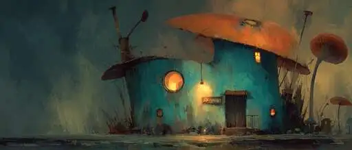
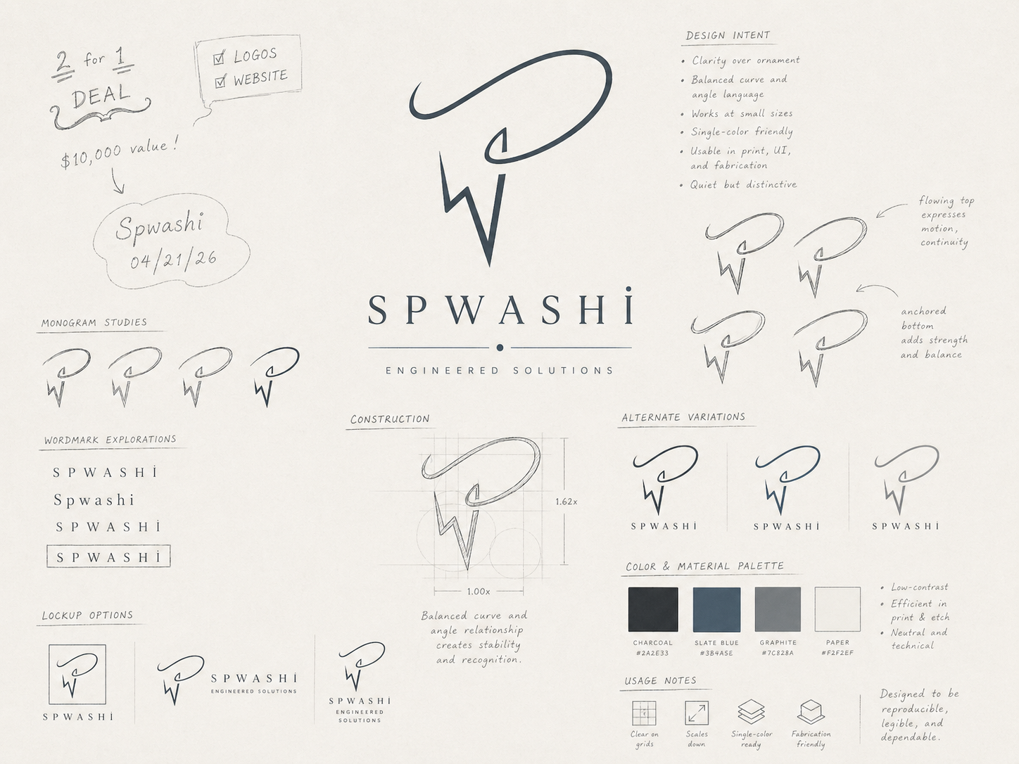
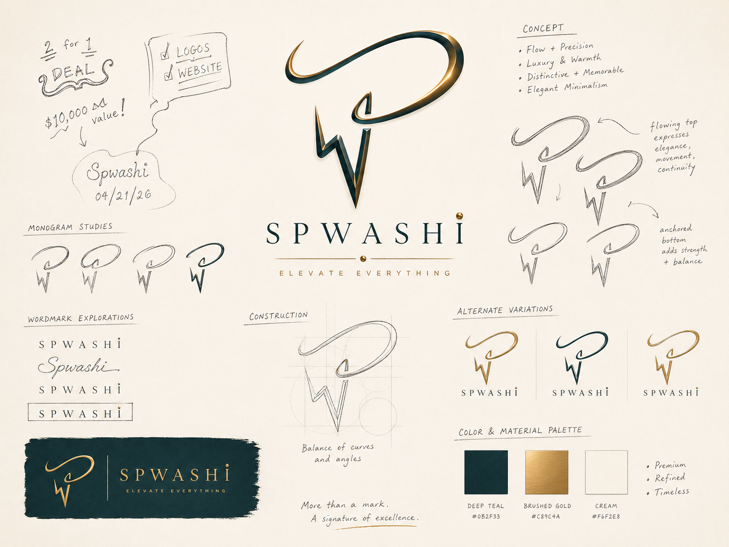
Logo concepts~common~premiumOccasion thresholdA landing image for the holiday feeling without naming the holiday: a page can invite return, preparation, and shared practice before the next occasion arrives.
A useful homepage is mise en place for attention: tools visible, surface clear enough to begin, next move findable without memorizing the whole pantry. Name the ingredients well and the same page becomes a story seed.
I have a concrete request.
Open Services, Cards, Now, or Contact when the work needs to become an offer, a referral, a UX-flow test, or a direct ask. This path helps when the page should name the next move plainly instead of asking the reader to translate the whole atlas first.
This route gives a collaborator a direct way to ask for help without first learning the rest of the atlas.
It produces a live offer path, a proof surface, or a small next action that can be completed quickly and shared without extra framing.
I want to keep the cadence public.
Use the current sprint, membership, and proof cards when the task is to help the work move forward. This route connects to the work-in-progress state, the recurring release cadence, and the small actions that keep the system alive while the public can still follow along.
This card helps when support is logistical rather than expressive.
It keeps coordination visible enough to share without turning it into a bigger task than it needs to be, which makes the cadence easier to trust.
I want to inspect the method.
Use About, Software, Settings, and the Website Field Guide when the goal is method, architecture, or inspection. This card helps when a route should explain itself before it asks for trust, and when the reading climate itself needs a visible control.
This surface exists because a reusable medium should teach its own structure.
Developers and curious readers can use it to find the method before they commit to the whole site, and to see which parts are browser-local versus authored.
I need a smaller next move.
Use Care, Topics, and proof cards when the problem is not only knowledge but getting your footing back well enough to act. Return here after the immediate pressure has been named, because the next move should be small enough to finish and obvious enough to start.
This route exists for moments when the page should lower friction before it asks for a decision.
It can produce a steadier entry path, a topic neighbor, or a proof card that makes progress visible without adding ceremony.
I want neighboring routes.
Topics, Town Atlas, Blog, Play, Research, and Tools are the broader lattice when you want to learn sideways. This surface produces neighboring routes, not just more labels, so the next click can feel like a good adjacency instead of a random exit.
This is the exploratory route for when a visitor wants to move by relation instead of by category.
It helps the site remain a field guide rather than a single-path funnel, and it makes the adjacent routes legible enough to compare.
I want to tune the boonhonk register.
Use the boonhonk register when the question is how a system behaves once disposition, signal, and recombination are part of the interface. This is the route for playful-social generosity with enough structure to stay useful and noticeable.
A local-first prompt instrument that turns a source ingredient and attention posture into copyable media or draft artifacts tuned to a collaborator's rhythm.
A low-stakes reading surface where a sticker becomes a portable handle, a team reading stages possibilities, and repeated associations grow into a theme without forcing canon too early.
Some visitors want story and accumulated craft. Others want the apparatus — routes, runtime, and inspectable structure. Both paths are first-class — and both should leave with a smaller next move than they brought in.
Every component here is a small machine for arranging attention.
For readers
Start with About, the Website Field Guide, Town Atlas, and Recipes when you want story, method, and craft in one readable loop.
Start with Design, Settings, Software, Search, and the inspect query when you want browser-local controls, CSS, and data attributes to explain themselves — not just render.
The center of gravity moves. Learning weeks, research weeks, playtest weeks, and publishing weeks deserve different doors.
Changed center
Follow whatever has pressure now.
Some visits are about support, some about proof, some about learning, and some about finding a route
you ignored the first time because it was not ripe yet.
Reasons to re-enter
Change is welcome.
Use a different route than last time on purpose. The atlas is healthier when it supports drift.
Wonder needs neighbors.
Software should be close to math, craft, care, and play so the questions can mutate.
Proof beats vague intention.
When a thought matters, turn it into a page, card, quest, prompt, or small semantic spell someone else can point at, inspect, and replay.
Novelty should deepen, not reset.
If you already read an earlier version, skip the intro and enter through a loop: pantry economics, a recipe category, an SVG behavior, a character hook, or a tool that turns the same idea into a local record.
Fresh entry
Pick the route that makes your next question stranger and smaller.
That might be topics if you need a map, search if you need a term to return through, cards if you
need a proof surface, or the blog if you need to watch fragments turn into
public form.
Integration loops for readers who already know the map
loops
These are sideways doors — not a second homepage. Each loop names a pressure, a reusable component family, and a place on the site where the idea can become evidence, fiction, or a tuned behavior.
Pantry microeconomics
A limited pantry is a rules surface: substitution cost, batch base, trade route, spoilage clock, and who benefits when a byproduct becomes stock. Use budgeting for sprint money, recipes for ingredient grammar, and RPG Wednesday when scarcity should become scene pressure.
resource → price → choiceRecipe category handles
Principle routes teach verbs before dishes: mise, reduction, fermentation. Category clusters — soup system, wing sauce, batch base, byproduct realm — are promptable without pretending the full recipe already exists.
verb → cluster → sceneSVG behavior lab
Path weight, label spacing, pointer fields, and wonder-memory carryover are easier to judge live. Start in SVG experiments, compare against CSS experiments, then project a diagram into Midjourney bench or a recipe card illustration.
stroke → field → screenshotCSS behavior lab
Contour grammar, cascade layers, and gesture states (charge, armed, sustained) are the same family as cauldron microinteractions. Tune in CSS experiments, inspect on Settings, then read the contract in the field guide.
token → state → legibilityCharacter and world hooks
Stock mentor, pickle trickster, and sauce mediator are recipe-native characters that can migrate to cast, world, or character sheet without losing their kitchen logic.
ingredient → person → traceTool evidence loops
Profile, character sheet, budgeting, and Midjourney bench are local state machines: enter material, shape a record, screenshot the moment, export JSON when useful. No standalone games yet — play routes and table tools are the live game-like surfaces.
input → record → carry
Creative development promptsone constraint · one artifact
Small prompts for members and returning readers who want depth without a new feature announcement:
Name one technique verb, one shopping list, and one character who would teach it from memory.
Sketch one SVG prop (token, ring, bubble, silhouette) that could appear in a recipe card and an RPG scene.
Tune one CSS state until a hover or hold makes the next action obvious without tooltip homework.
Run one sprint budget against a real creative constraint: time, food, print, hosting, or release week.
Plant one spell trail in the footer cauldron, then revisit it from Town Library a week later.
College-level thinking through a playable library: session notes, guide characters, studio quests, and curriculum surfaces with mandatory boundary tests. Choose a role, name the pressure, make the artifact, carry the evidence forward.
For the story substrate itself, move to the Town Atlas. That keeps the practical
library and the world bible separate enough for humans and models to review without guessing which page is
doing which job.
Start a first quest
Make a route map, quest seed, or systems diagram in one sitting, then save the reflection as evidence.
The kernel, component tags, and attention handles you tune here can travel with you — garden sediment meeting apparatus inspection. Feed them with garden prompts, compose them in the cauldron, or plant spell trails along ecological channels the Library can tend and replay at each collaborator's rhythm.
Privacy stays direct: drafts are not automatically public, screenshots should say why they exist, and shared records should expose only the context someone needs to act well.
A skill surface should return something for the attention it asks: a clearer question, a usable pattern, a replayable spell, or a next move you can actually take.
Learning game
Notice, name, fold, note, return.
NoticeFind a word, ingredient, operator, prompt, scene, or interface behavior that makes you curious.
NameUse the visible label, Spw sigil, or nearby copy to give the discovery a handle.
FoldOpen the details, related route, or resonance peer that keeps the idea one handle away.
NoteWrite the smallest useful question, recipe, sketch prompt, or genre move before the context evaporates.
ReturnReset the page, change the climate, or revisit the route later to test whether the idea stayed legible.
Gratitude
Thanks for staying with the strange routes long enough to find a handle.
Wonder is useful here because it keeps software, art, care, and play from sealing themselves off too early.
Rewards
A smaller next step
A route, card, or tool that makes the work feel startable.
A cross-link worth testing
A neighboring skill surface to borrow from before the thought stiffens.
A replayable spell
A screenshot, prompt packet, card, or route sequence you can run again under different conditions.
A reason to collect
Collection should mean “this helped me notice,” not “the page awarded a score.”
A route back to the term
Good vocabulary should help you rediscover the route, prompt, or proof card after the first reading fades.
Minimal keeps the page quiet. Field shows nearby relation cues. Rich turns vocabulary, prompts,
ingredients, and Spw handles into a more collectible learning surface.
Runtime plumbing
Show why scripts are present
Turn on module visuals when you want rails, seams, and handles to say which scripts evaluate
semantics, layout, state, visuals, routing, or interaction.
Four routes if you want component diversity: glossary, live playtest, public kitchen, and texture/support. Returning readers can skip straight to the loop that matches today's material pressure.
One card makes the work easy to start. One card gives the page a reason to change tomorrow. Both work without JavaScript.
Daily promo
@
Help the next release land
Releases are scheduled for the 13th and 26th of each month. The A cycle closes on the 13th, and the B cycle closes on the 26th. Small support keeps the work moving and makes the next page easier to ship.
A direct contribution keeps the monthly cadence steady.
Read the site as prose, grammar, outputs, or system
layers
Prose mode
Surface lens keeps the homepage anchored in readable public language before asking you to inspect the machinery.
Every character in <Spw>
is a cognitive gesture. A frame #>
orients. A probe ?
opens inquiry.
A reference ~
reaches without binding.
An action @ commits.
A surface > projects.
The same unit can be stressed differently depending on context. A word may be plain prose in one
paragraph,
a topic handle in another, an
? operator route
somewhere else,
or a label inside an SVG.
Grammar mode
Syntax lens turns the same homepage into an inspectable structure. Operators are vocabulary,
braces mark containment by attaching local value and behavioral intent to a stable root,
and the lines below show how the copy can become a reusable spell.
#>home_frame < orients this unit of meaning
#:layer pragmatics < qualifies interpretive layer
^"reading_layers"{
  ?[word] < asks what a word is doing here
  ~image < relates text to nearby study
  @accent < commits a local emphasis
  *topic < connects repeated themes
  >surface < projects visible hierarchy
}
&[context]{
  =part_of_speech "noun|verb|adjective|operator|topic"
  $meta "panel|caption|card|image|route"
  !constraint "stay readable in plain text"
}
Website lens explains the site itself as part of the practice: a field guide, a publishing surface,
an observatory for settings and states, and a test for whether a site can stay readable while becoming
more semantic, promptable, and cross-referenceable.
The practical thesis: readable syntax can give people and tools the same map. A typographic layer
becomes more valuable
when it is also a semantic layer.